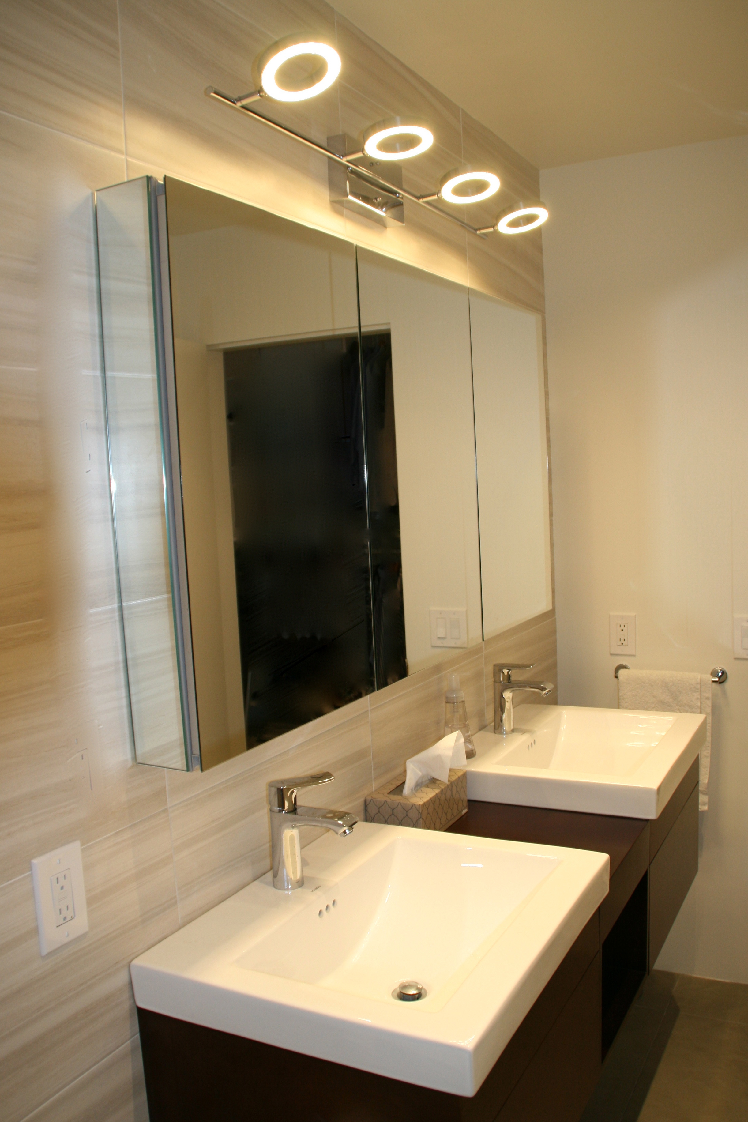
 The master bathroom in my mid century modern beach house was a small, sad place for the longest time. It’s only one foot wider now (a foot was taken from the master bedroom next door), but about 6 feet longer. That might not sound like much but it made a world of difference to this forgotten corner of the house.
Looking at the ‘after’ photos, I can see how masculine the bathroom looks. I’m ok with that. When you’re dealing with tight spaces, the trick is to use bold but simple strokes and keep the color palette to one or two tones.
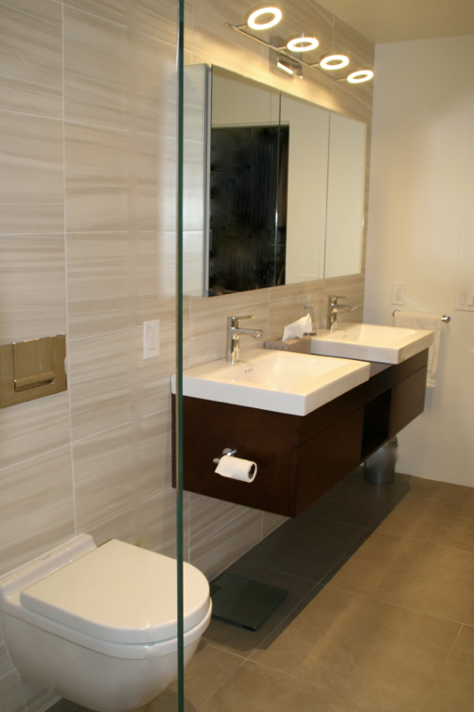
My one fun element is the lighting over the heated, mirrored cabinets. I was so worried this light fixture was going to look silly compared to everything else in this room, but now they are my favorite thing!
To enhance the feeling of width, I kept the bulky items: the vanity and toilet, along one wall which is similar to the previous layout. I also ordered both items in wall-hung versions so the floor is visible from one wall to the other.
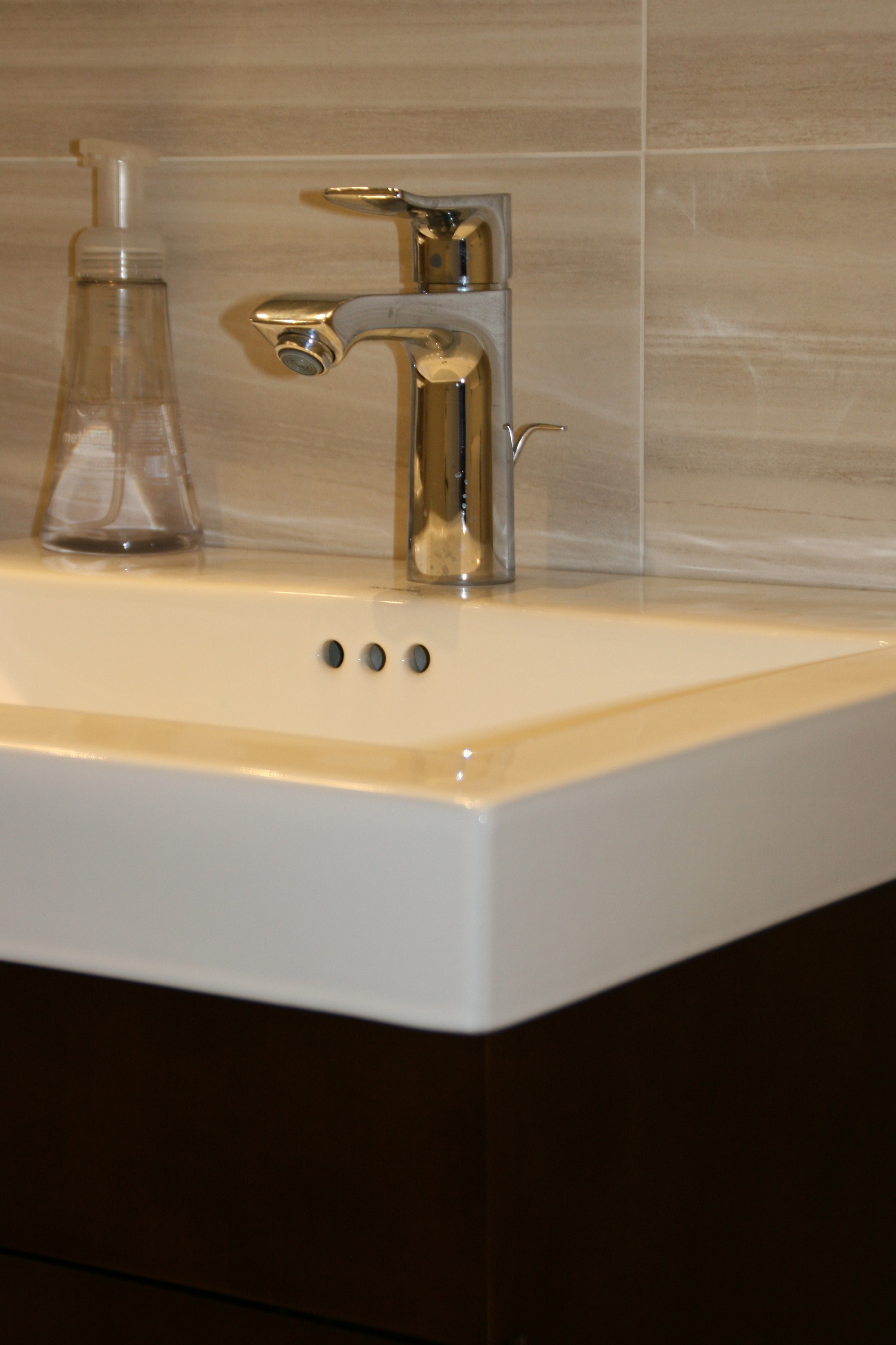
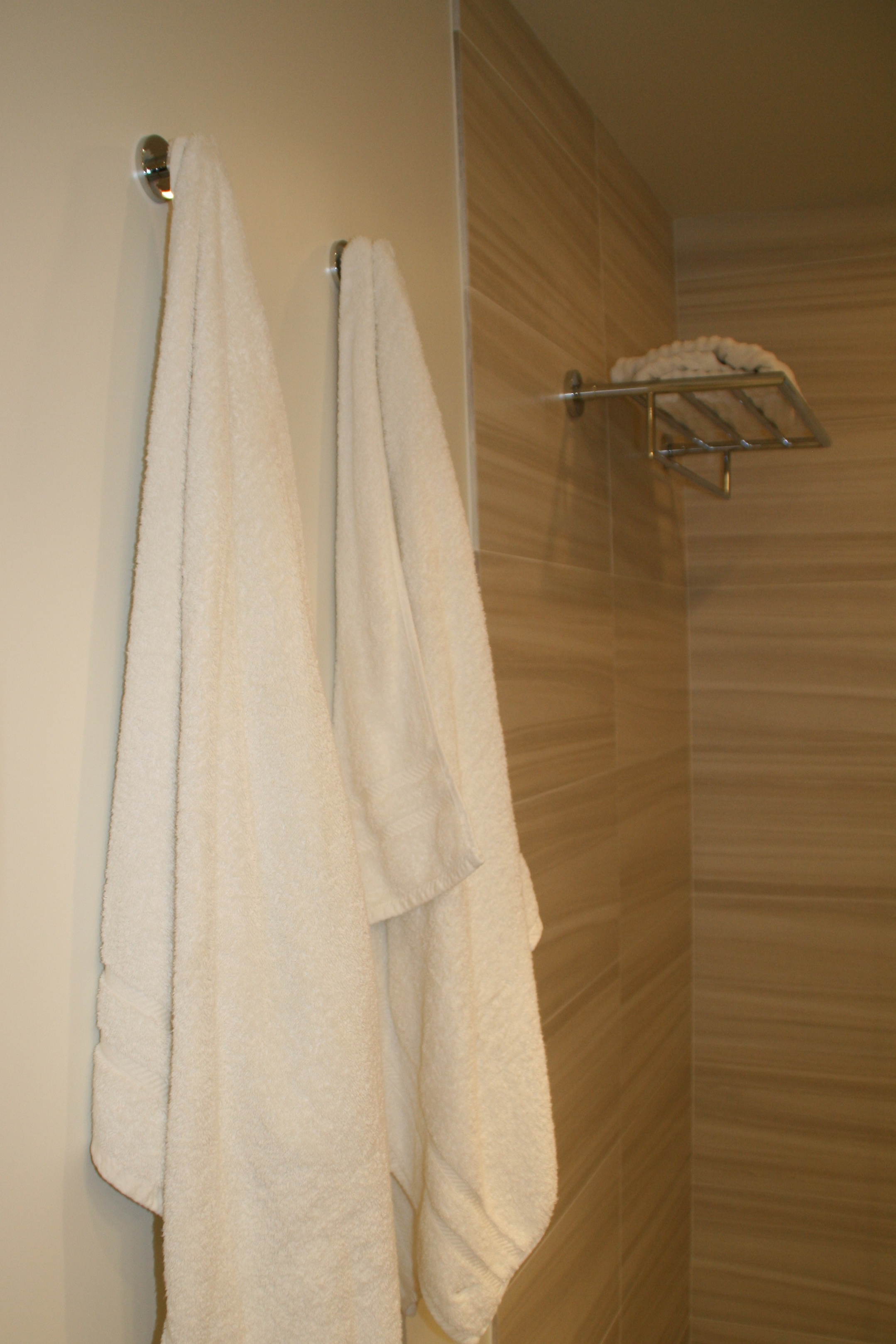
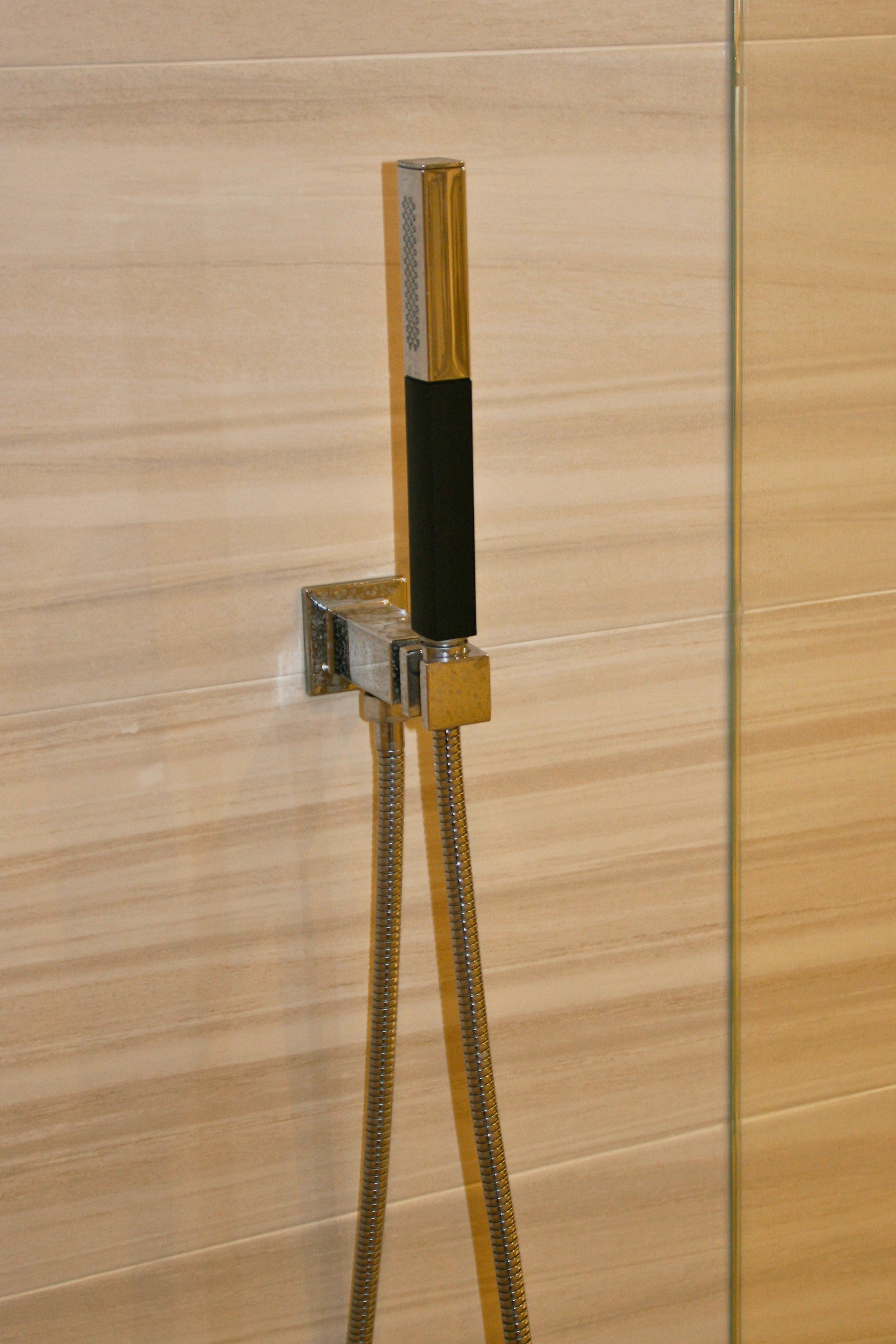
 A single sheet of glass divides the shower from the rest of the room. All fixtures are chrome and the 12″ x 24″ wall tiles only cover two of the four walls (except for inside the shower), so the modern striated pattern on the tile doesn’t close the room in at all.



Julie
June 29, 2014That extra foot has made a mile of difference! Great remodel.
Helen Cooper
August 7, 2014I love the clean lines and wide tiles in your gorgeous new bathroom – what a difference.