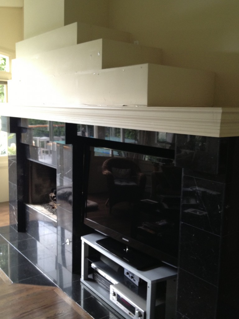
 This unwieldy black marble edifice is not something we’re planning to keep in our pared down post and beam remodel, and with TV’s as slim as a sandwich and fireplaces much neater than they used to be there’s no need for it to jut so far out into the family room. But it didn’t make the cut in this year’s remodel budget and it does it’s job well, keeping us warm, cozy, and entertained.
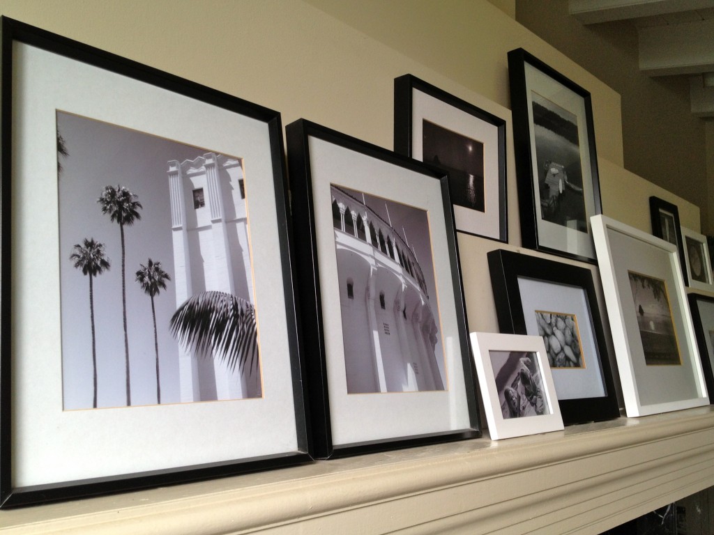
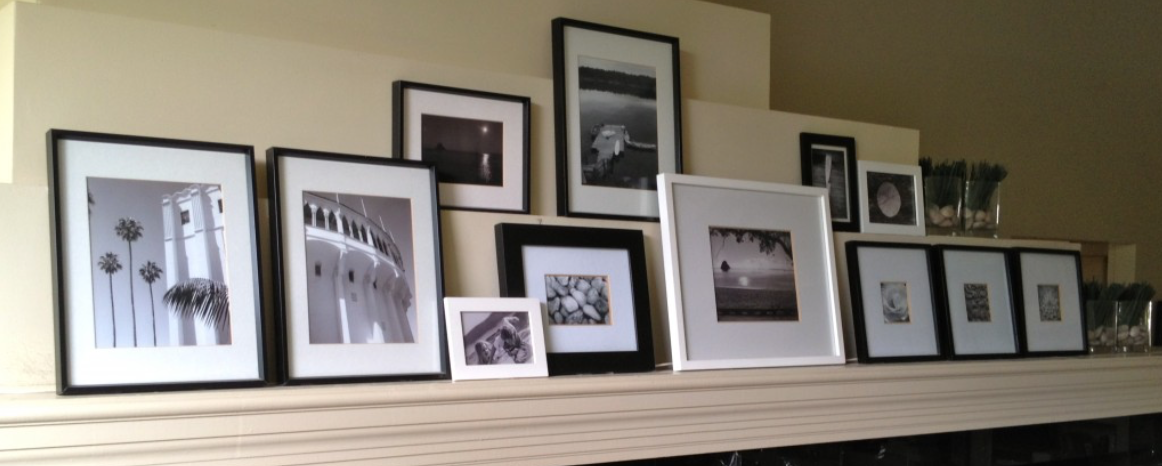
The problem is the mantel. There are a lot of layers and it’s a hard one to personalize. We tried a large mirror, but it sat too high and looked weird, we tried leaving it empty and it looked too bare, so I printed a bunch of my own photographs in black and white and framed them in gallery style mounts and frames from here.
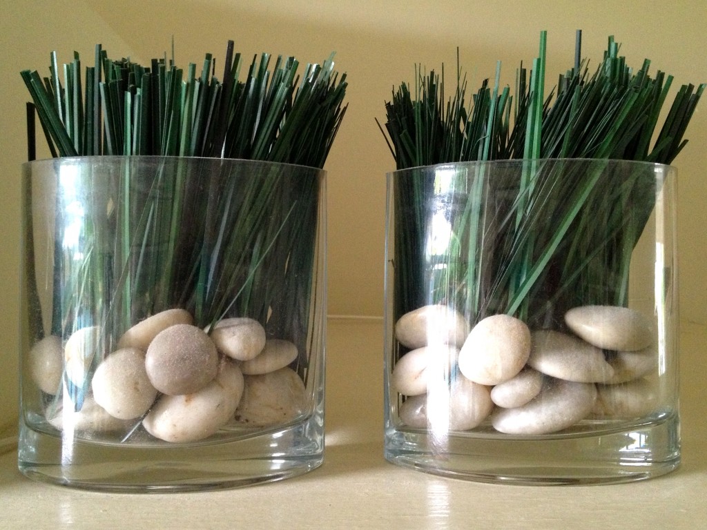
 I added four glass vases filled with white pebbles and green artificial grasses (cut from a large bunch bought here), to add some natural interest and a little bit of color at the end of each row.
When arranging the frames, make small groups of similar photos e.g. a pair and a group of three, then link them to the others by overlapping some of the single pictures. The black and white ties them all together. I like my newly decorated mantel so much I might just push this part of the remodel into the year after next’s budget. Or maybe the one after that…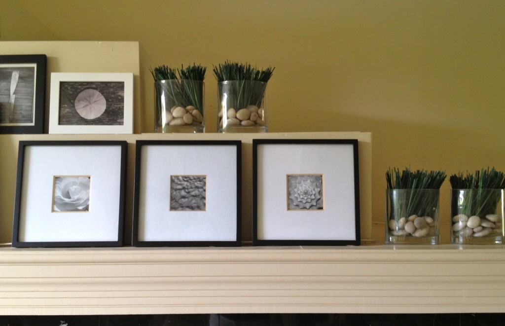



90266Elise
July 24, 2013Love the mantel display and the beach theme in the photos. Is that Catalina’s Casino in one of them?